Testing
At a test event hosted by Empatic UX, I ran moderated usability tests with eight participants. Each user was given a booking code and a check-in date, and had a few minutes to get their keycode.
End-to-end design of a web app for guests of receptionless hotels and holiday homes
Framing the problem
What do you lose without a receptionist, and how can you still support guests with an app?
Guest
The app had to function like a reception and help guests check
in, find their room, and learn about their stay so they never
felt alone or like they were missing information.
Business
Primary: reduce support calls related to check-in, deposits, and
missing keycodes.
Secondary: increase damage reports, capture early checkouts,
upsell regional services.
Validating with an MVP
Before the guest portal, I worked on a small web app solving two business problems:
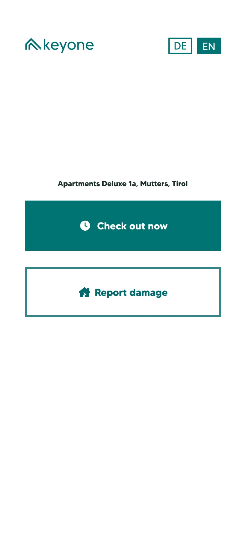
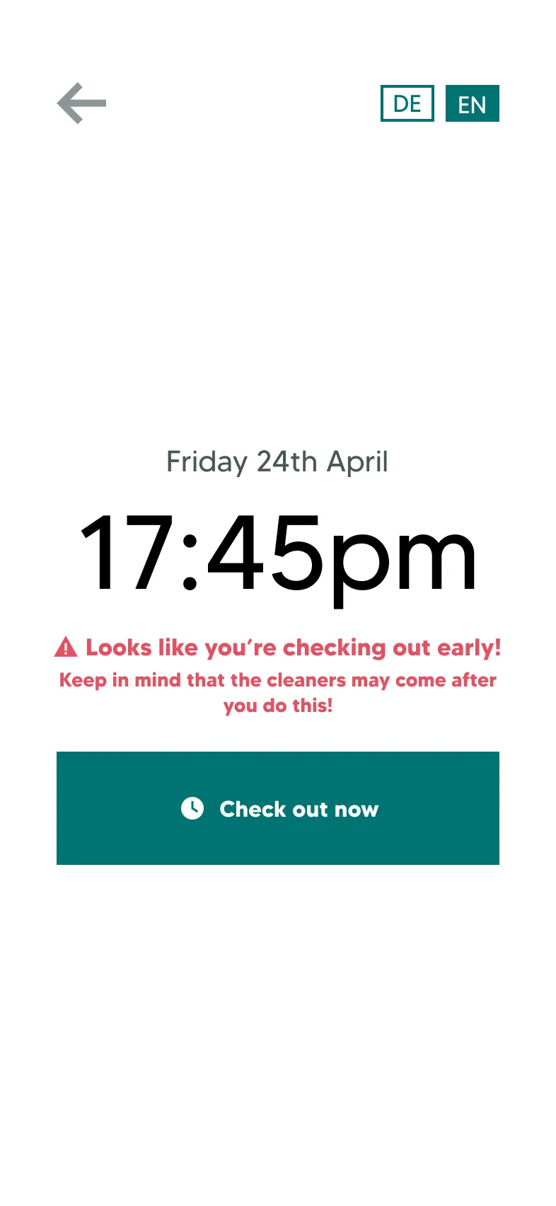
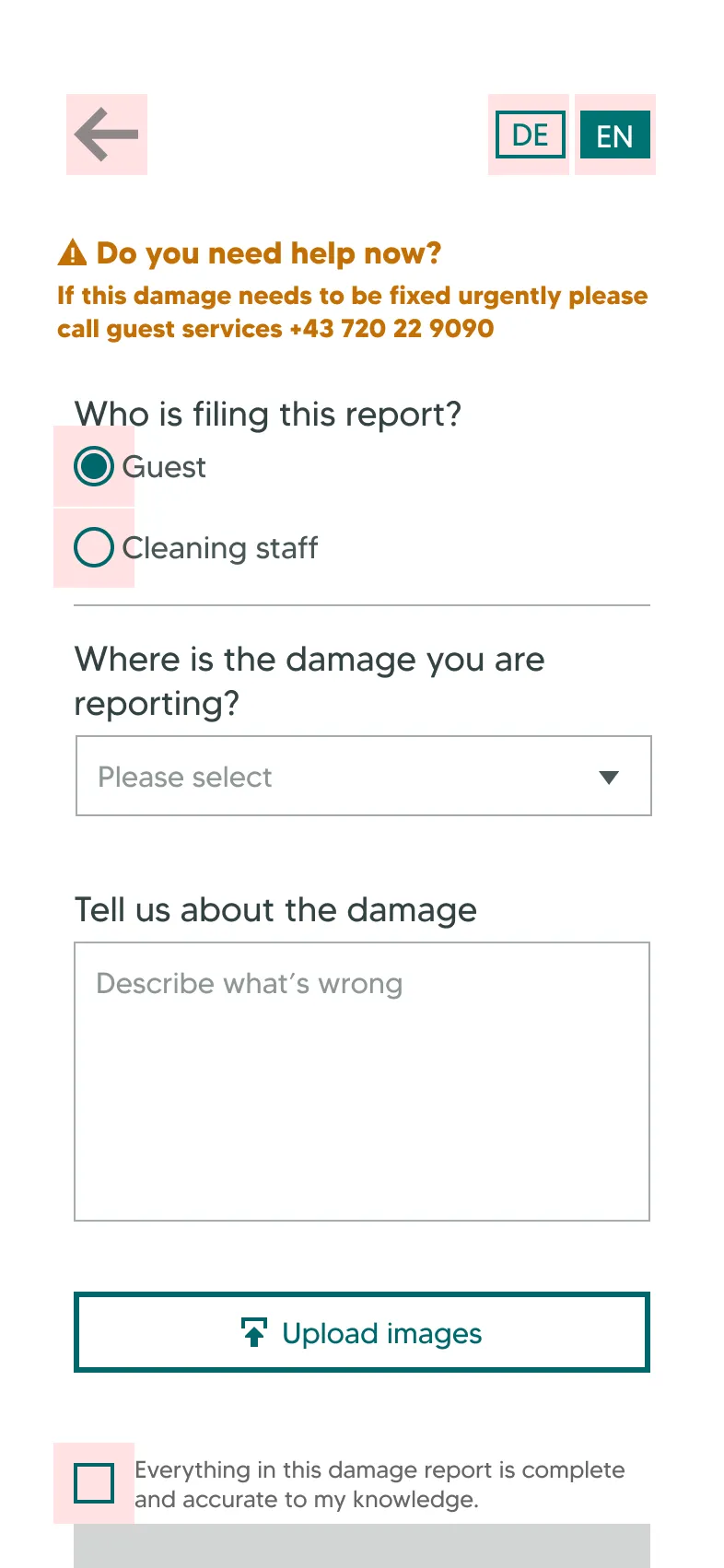
A unique page for each bookable unit, accessible by a QR code printed on an A5 sheet and stuck behind the door of the accommodation. The two functions seemed simple, but both hid several states and edge cases I discovered while designing.
It ran for one summer season. Damage reporting was used; early check-out less than hoped.
From here, we could see the case for a single web app consolidating everything about a guest's booking. I named it the guest portal, because who wants to download another app?
Defining information architecture
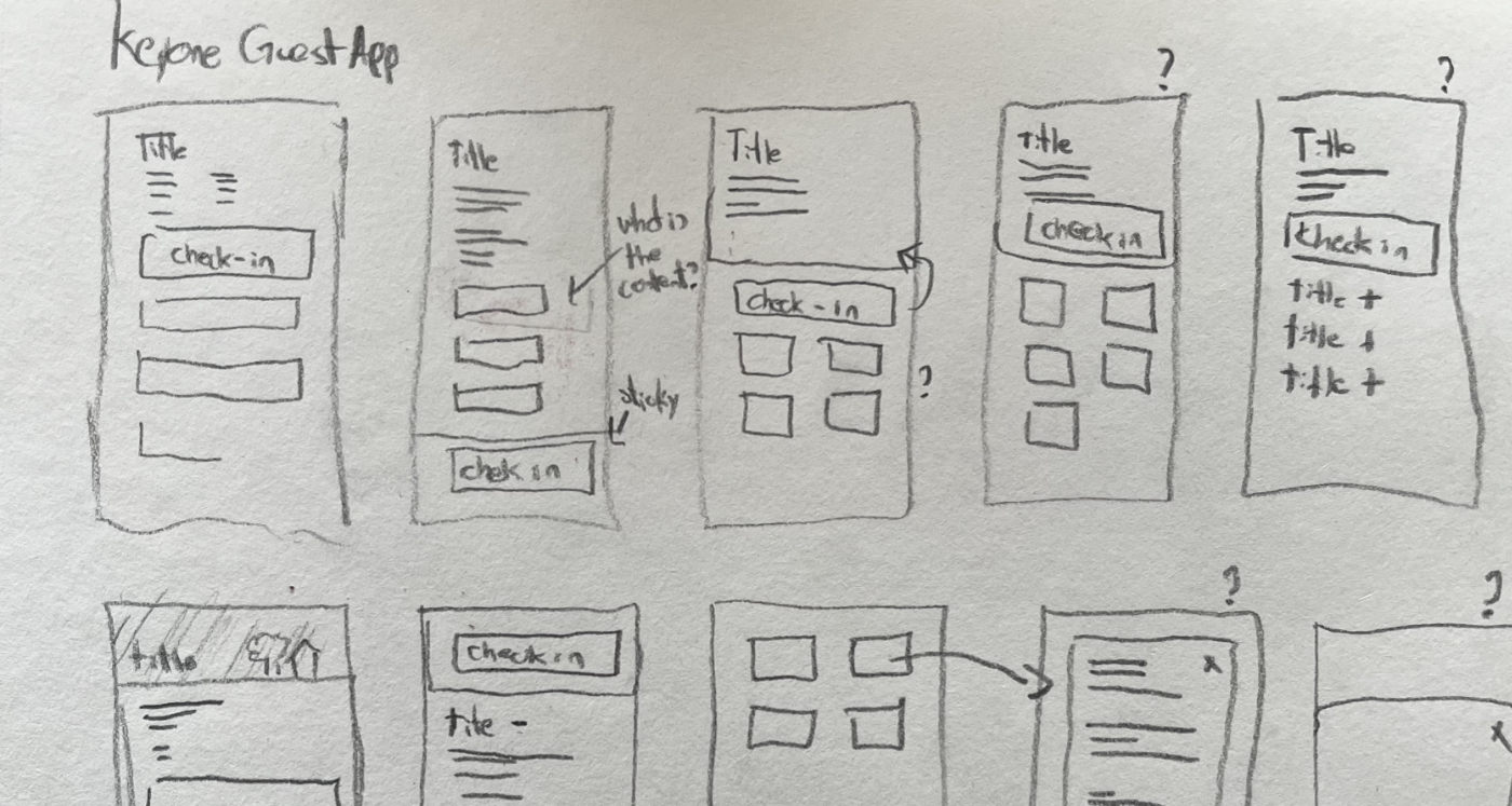
After an audit of everything a guest needed across a stay, I could see that because the information was input by individual account managers, details came in varying formats.
I could not assume what any field would contain, or whether it would contain anything at all. The unpredictable content meant a constrained or a static layout would fail.
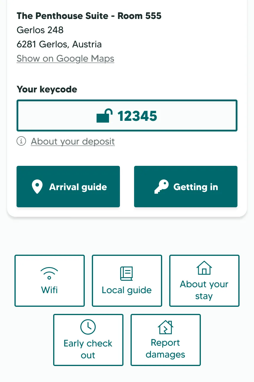
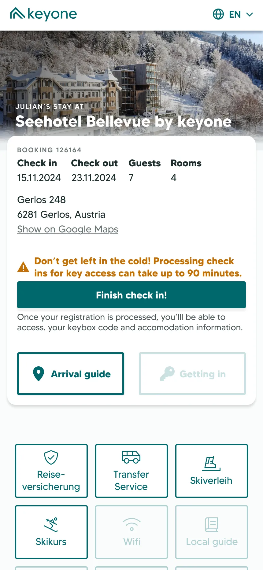
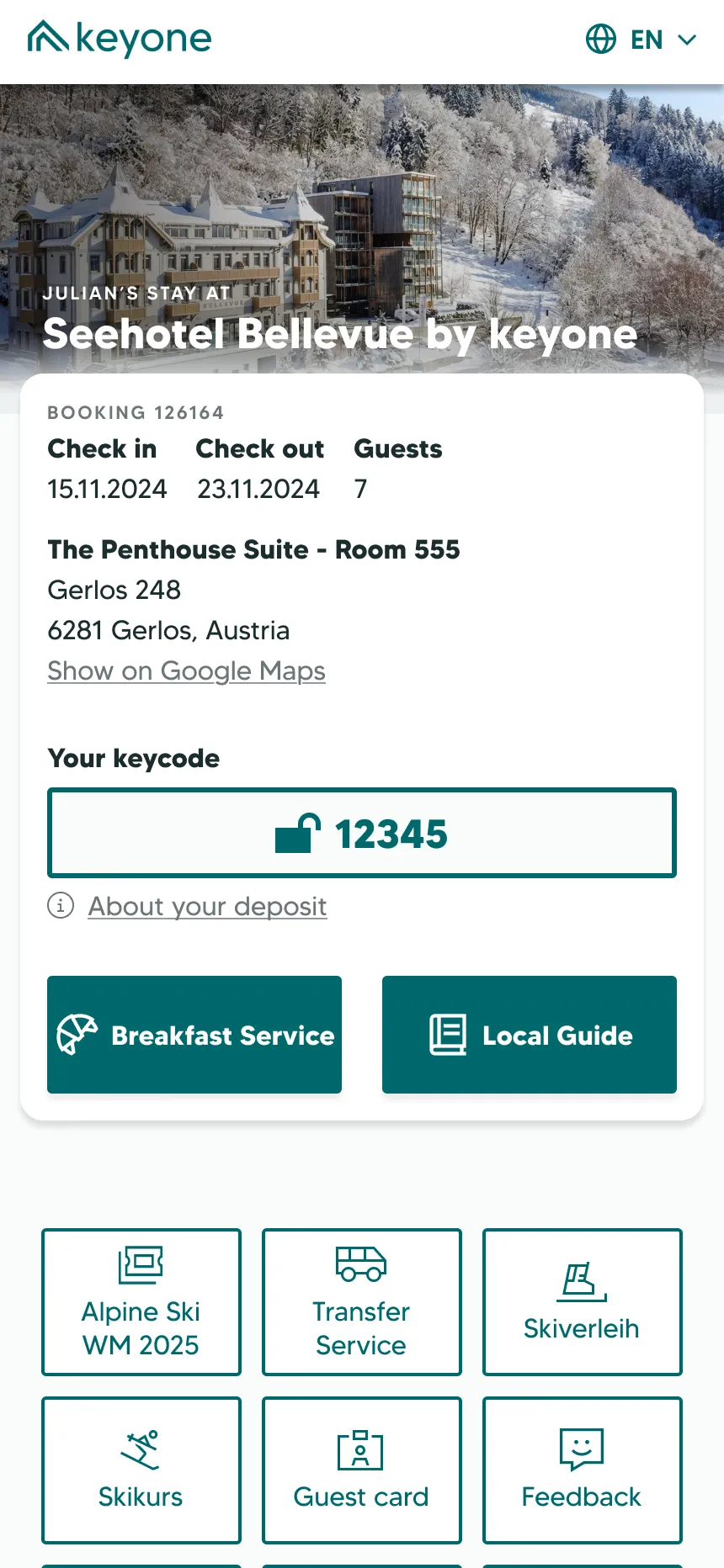
A hero card at the top to hold details about the guest's current tasks, and a grid of secondary buttons for other information below.
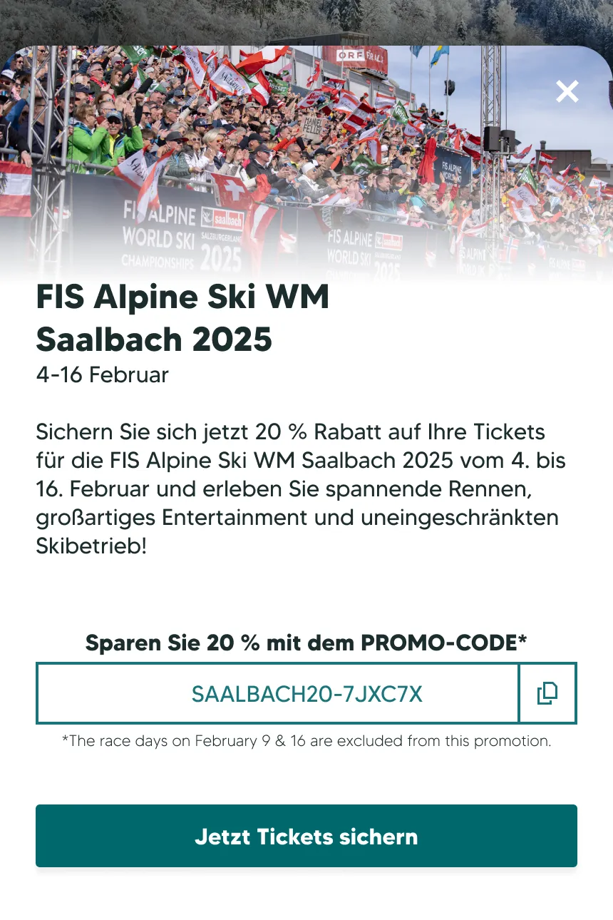
Each button opened a slide-up panel built from three components (title, text, image), filled from backend fields in a set order. Empty fields were skipped, so any mix of content rendered cleanly. New content would mean building new buttons.
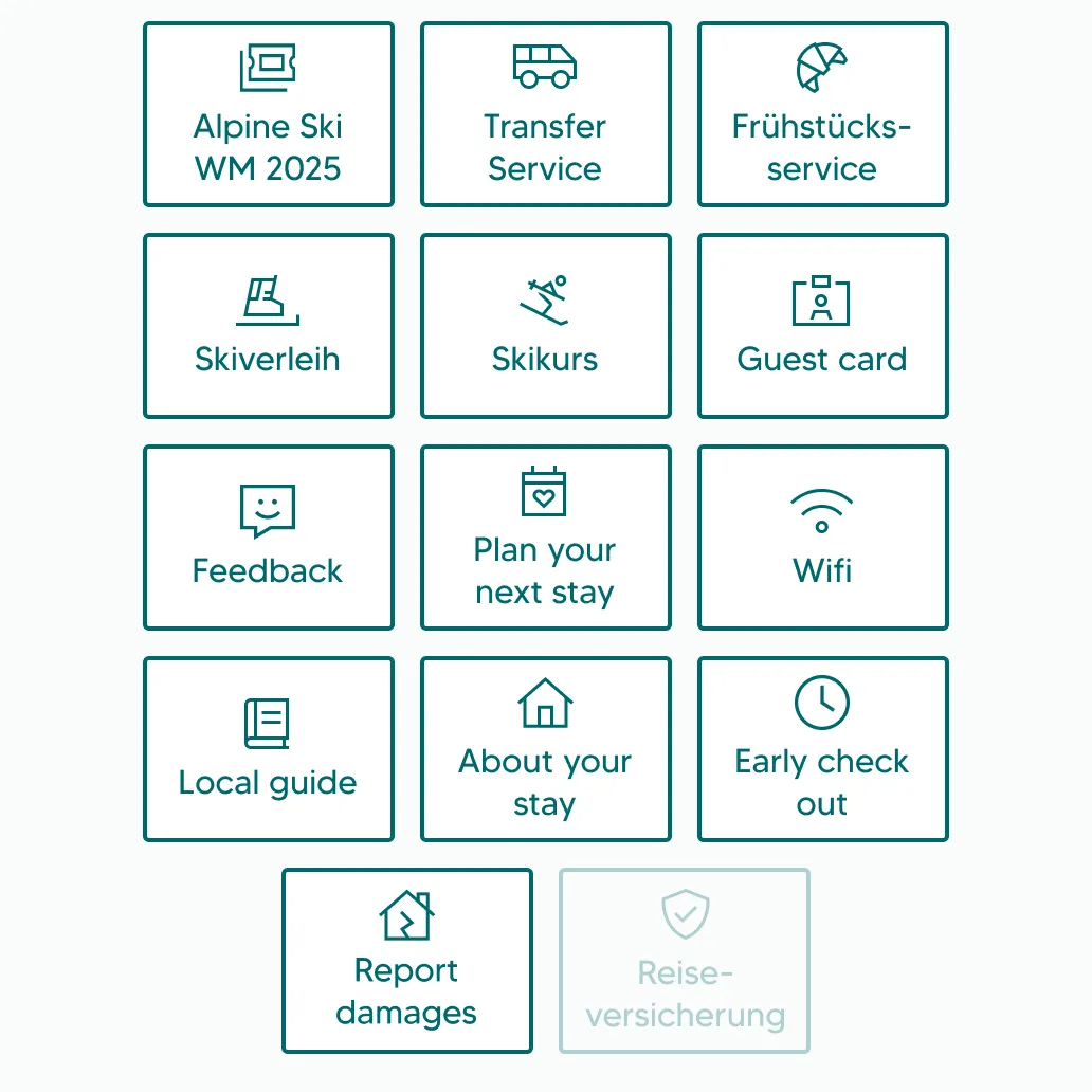
The grid grew as the business added features – to over fourteen buttons in some cases. These were all in some way essential, and had to be absorbed. The accordion I had vetoed would have handled that volume better.
Designing for the guest journey
There are multiple phases to a guest's stay – how can we prioritise information at the moment the guest needs it?
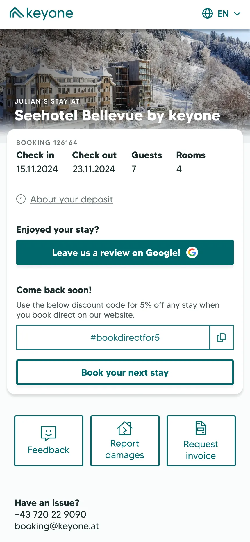
The hero card only ever holds what matters to the guest's current stage of the stay. Buttons below the hero card are for less relevant information and are disabled or hidden as needed.
When operations couldn't confirm a check-in or payment instantly, the button showed a toggletip explaining the delay and giving the support number, rather than showing the task as incomplete. We later cut the delay to seconds, making this irrelevant.
The business requested a "book-again" prompt in the hero card mid-stay. I pushed back – it was not relevant for the stage of the stay. As a compromise, this became one of the buttons crowding the grid.
Iterating on a live product
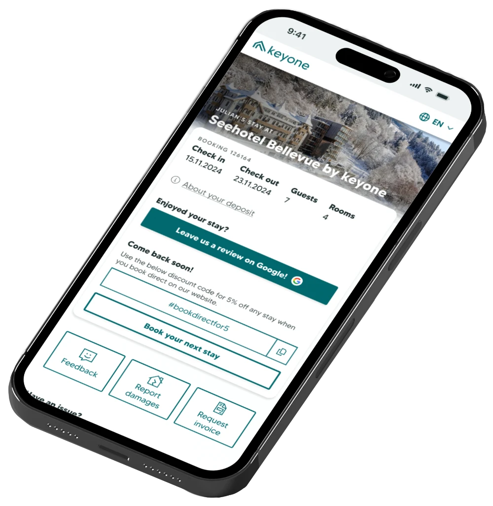
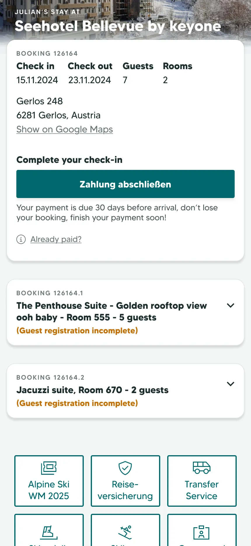
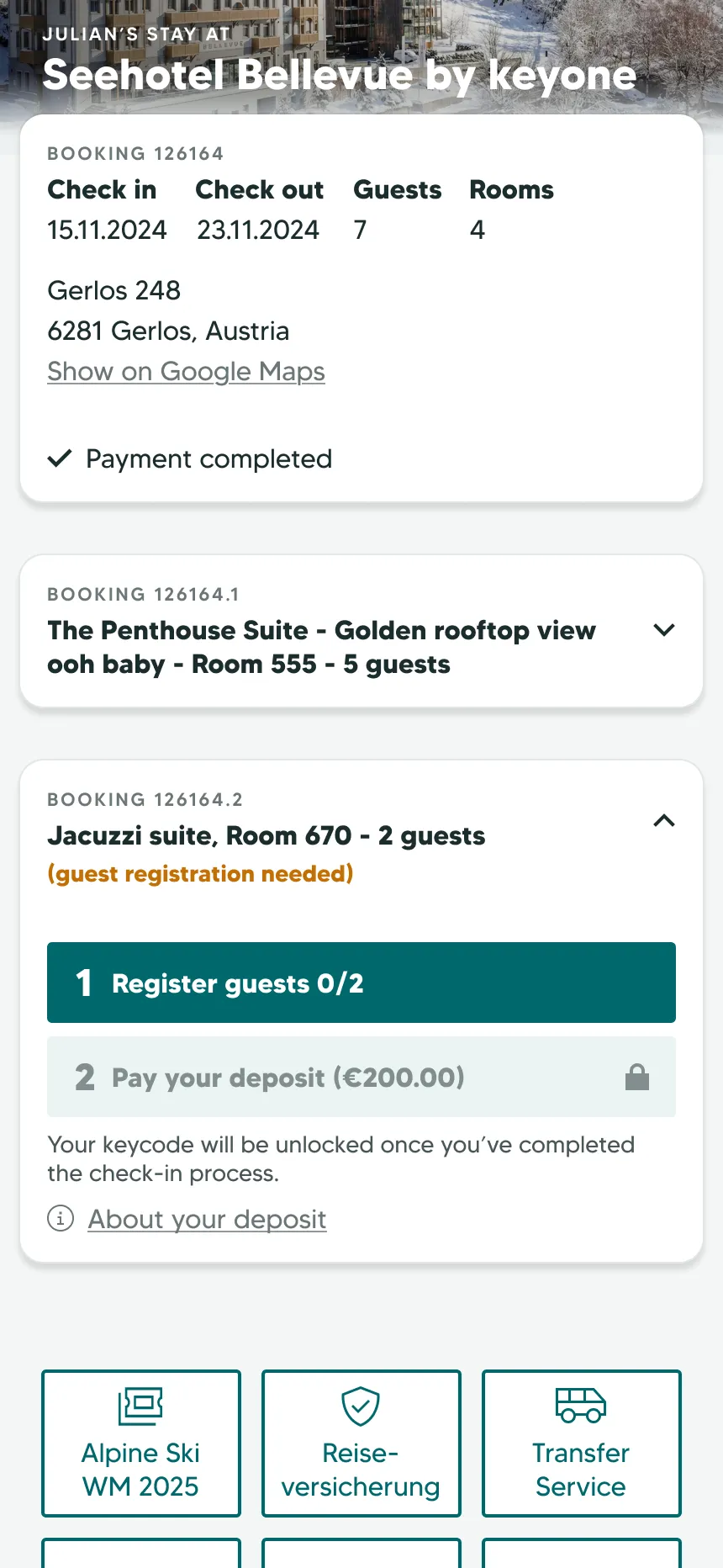
After the first year of the guest portal, we saw a problem with a small but significant share of bookings. Bookings with more than one room got split booking numbers – each indicated by a decimal (e.g.; 1000.1, 1000.2). These guests received a barrage of duplicate information; 2–5x the emails and a guest portal login for each room. This made a headache of tracking tasks and keycodes.
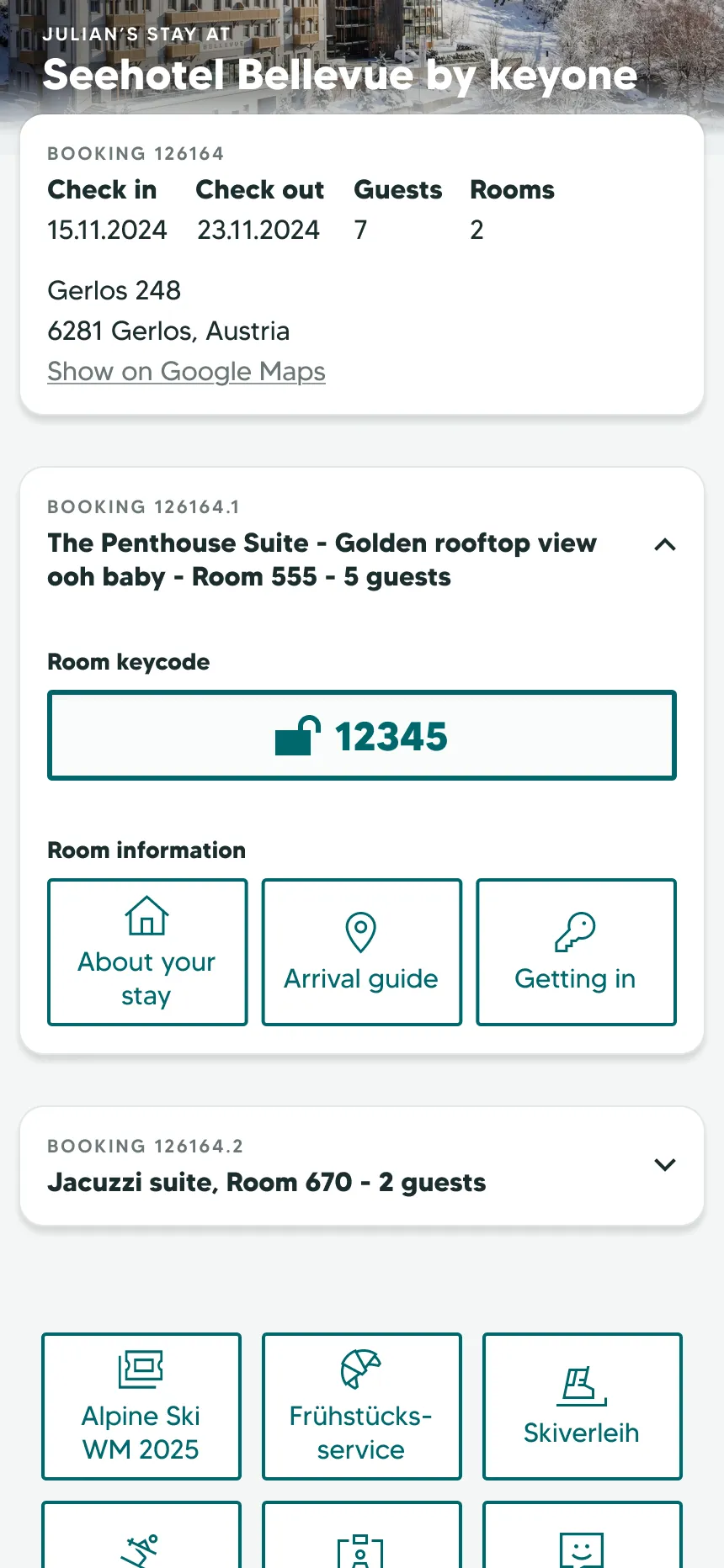
Login was adapted so any of the booking numbers worked as a login key. The hero card became a booking summary – dates, guests, and number of rooms. Each room got its own collapsible card with its own keycode, getting-in instructions, and open tasks. A card with an outstanding task was marked and opened by default; the others stayed closed so a five-room booking did not become a 2000px-tall screen. Putting all rooms under one login meant duplicate emails were also cut.
Some of the grid buttons were unique to each room and had to be contained on the new room cards. This broke the original layout and triggered the first (and only) overhaul of the design – an opportunity for me to fix some old mistakes. I revised margins, padding, and type hierarchy across the app.
Usability testing the check-in kiosk
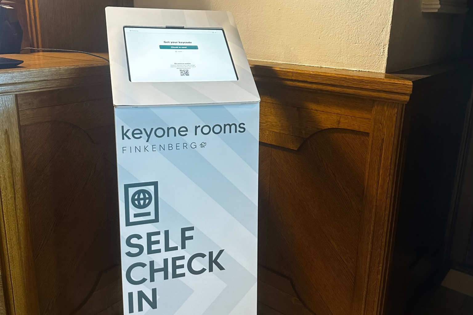
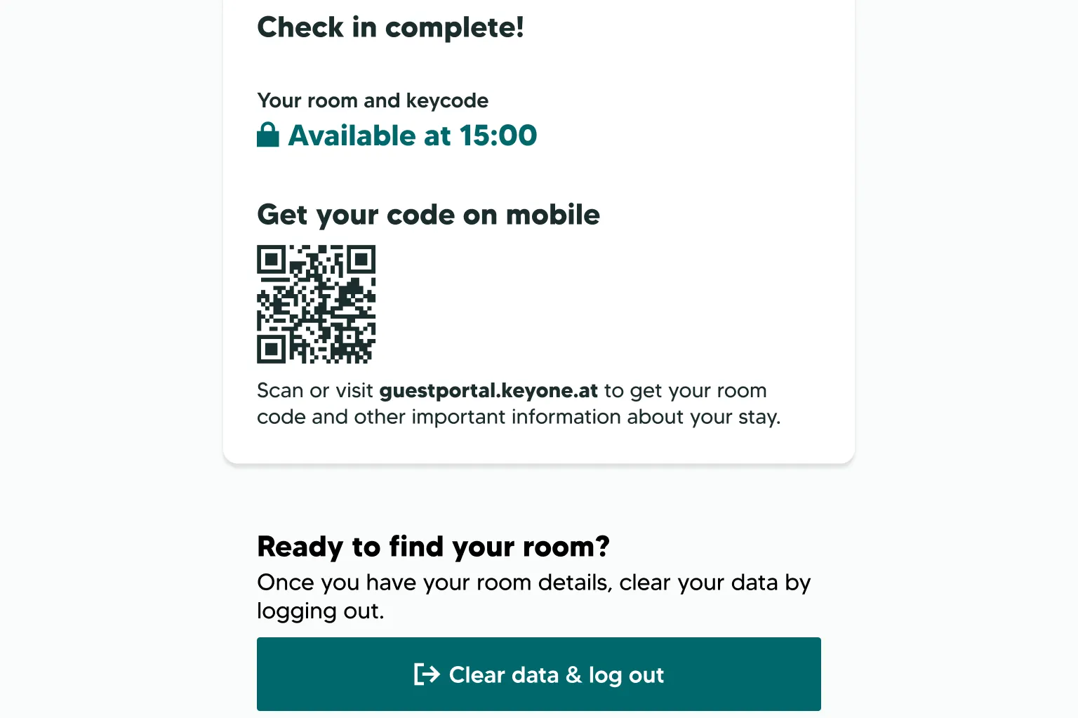
As the keyone hotel line expanded, we placed kiosks in the hotels, where guests arriving at the property could pay and check in. These kiosks ran an extension of the guest portal – a tablet version where guests could only access critical functions: keycodes, Wi-Fi, and check-in.
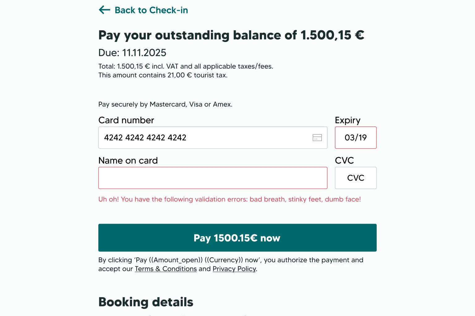
To make this possible, I designed a simple payment flow that interfaced with the third party provider. We added an iframe for our 3rd party guest registration provider. These prevented users from leaking to the open internet on the tablet.
At a test event hosted by Empatic UX, I ran moderated usability tests with eight participants. Each user was given a booking code and a check-in date, and had a few minutes to get their keycode.
Almost every user stalled at least once, unsure what to tap. The way the iframe was set made the form look complete, when users actually had to scroll further down. Only 3/8 users were able to check in within the allotted time.
I made smaller UI changes and the devs reformatted the iframe. A re-test at the company Christmas party confirmed users could get through, so we launched kiosks in six hotels that winter, then rolled them out to more properties in the summer.
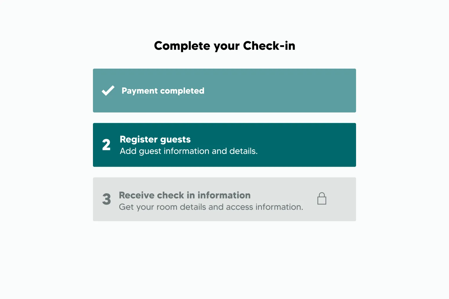
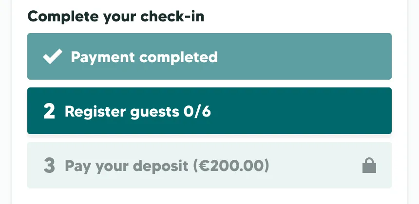
After the kiosk was rolled out, I updated the guest portal to include the new in-house check-in process. I adapted the kiosk's checklist system for the hero card, moving extra buttons out of the way until after check-in to make the guest's next step clearer.
This was designed but not implemented before I left.
Designing for accessibility
Everything above was made with a component library I built early in the project, though not every spec survived implementation.
The palette was kept plain, with white or off-white backgrounds and our brand teal. Later I added a modified version of the brand teal for key elements like borders and button text to push above WCAG AAA contrast requirements, and provide exceptional contrast without diluting the brand.
Alert colours were adapted to fit the palette and checked for contrast against a pure white background to meet WCAG AA for large text and graphics. Unfortunately, after the build I caught that bold text was not enough to qualify as "large", so the 14px size of the orange alert text fell short. In the next iteration of the system I would have solved for this with a different size or colour.
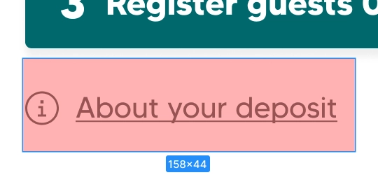
Every interactive element was designed with space for a minimum tap target of 44px.

Gradients over images that could vary wildly were spec'd to ensure contrast with text.
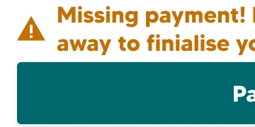
Statuses carried more than one cue, so understanding never depended on colour alone.
The text on all states of the buttons kept a contrast ratio of at least 3:1 (even when not needed - in the case of the deactivated button).
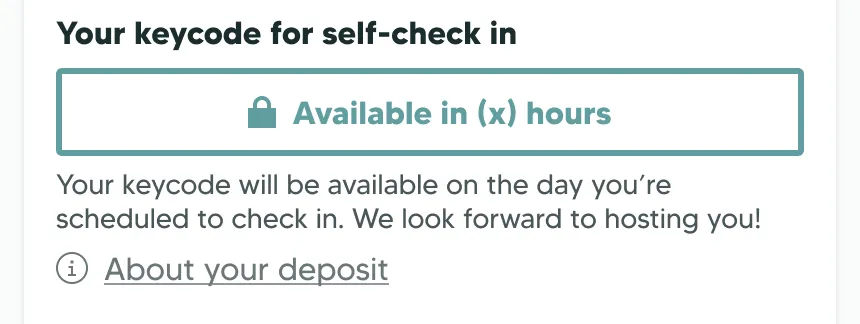
The modified primary teal was used on the deactivated items, with transparency set to give the necessary contrast to meet WCAG AA for large text.
Analysing winter 2026 data
Yes and no. The app was used as intended and primary goals were achieved – the business saw a reduction in support calls and guests were able to complete critical tasks. However, the features connected to the secondary goals were not being used as expected.
44% of users opened Getting in and 43% Getting here, meaning the primary buttons for that stage of the user journey were doing their job.
However – combined use of features like upsells, early check out, and damage reporting accounted for under 5% of the users. A 17k monthly session count over 8.5k users told us the average guest had only two sessions: we could infer that one was to check in, one to collect the keycode.
I couldn't tell whether we faced a discovery problem or a content problem (lack of interest). We couldn't count number of sessions per booking, or see if guests came back mid-stay. Scroll depth was useless when the height of the page varied by property. As part of my handoff, this was the problem I documented for my successor.
*Guests who rejected cookies not counted.
Documenting next steps
I analysed the winter data on my way out. My final act as keyone's product designer was writing a set of suggestions – starting with changing the tracking quickly enough to catch the last of the summer guests, giving my successor the data to design a fix before next winter.
What I would do differently
The accordion menu I sketched during the initial design phase haunted me through later phases of this project – my biggest mistake was not giving it enough consideration. Eventually, I saw it as a better solution but could not change the product.
Given the development constraints, I should have cooked in better analytics from the start, and evaluated them more frequently and thoroughly. This would have resulted in a more dynamic and useful hero card earlier on.
I still do not believe a receptionless hotel can offer the same level of service as a traditional model. That scepticism is why I put so much heart and effort into this project; it was a problem I thought genuinely needed to be solved for our guests. Looking back at it, I can see all the ways I would approach this product differently – but that's now knowledge I can apply to the next one.
If anyone from keyone ever reads this case study (hi Mobert, Pali, Helle), cheers, and thanks for trusting me to build this.